Fabric is a dead simple one-page responsive framework with a couple super useful features. No pre-fab buttons or styles, just one small set of files ready for you to get to work with.
MOBILE FIRST
(...Imagine that! What isn’t these days?)
RESPONSIVE
(takes a short while getting used to, but it doesn’t suck)
SEMANTIC MARKUP
(clean code = happy code)
The Problem
Fabric was developed out of the love of single page site design and the want & need of a very basic system to not only deploy single page designs but address some important responsive design problems. Most modern responsive frameworks dive straight into complex systems of displaying content and often are found bloated with pre-made buttons, specific styles, and fancy behaviors.
f<img>
Responsive Image
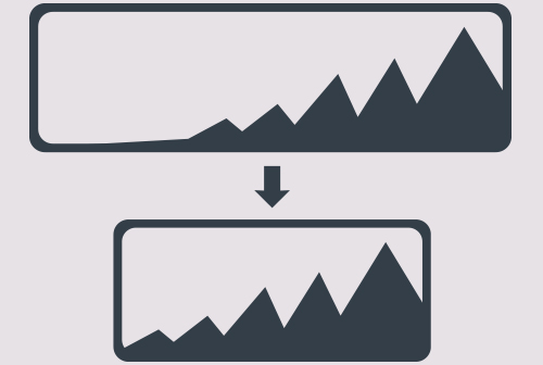
The issue with making images responsive is that there is no simple and commonly used way of approaching this problem. To use some big and clunky script just to make images behave the way that you want them to on a single page site is a bit awkward. Fabric is a lightweight solution to single page deployment and so should be the responsive image functionality. We developed f<img> to be as simple and small under the hood as possible.
In The Page
Place the "resolution" div in the header.
Example of an image element in the HTML structure, as simple as that.
Load The Image
Assign appropriate font size (width of image) to specific media queries. Append a matching "font size" to your images so they can be displayed at specific page widths that you signal in the media queries.
Example: "image.jpg" (original image), "image-640.jpg" (image that will load in place of original) will display when page is at 640px wide (#resolution { font-size: 640px; })
Example
Assign appropriate font size (width of image) to specific media queries. Append a matching "font size" to your images so they can be displayed at specific page widths that you signal in the media queries.
Example: "image.jpg" (original image), "image-640.jpg" (image that will load in place of original) will display when page is at 640px wide (#resolution { font-size: 640px; })
f[form]
Simple Form
Everyone deserves a simple contact form, no matter the project and/or how complex it might get.